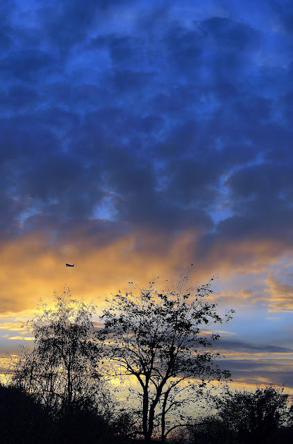
A journey of photographic adventure, Two Views was born by two friends having a blast and learning from each other on a photo shoot in the autumn sunshine, asking the question “How can we continue to push our photographic boundaries in terms of technical knowledge, new challenges and creativity and have fun at the same time?” The answer we came up with was to set ourselves a project every two weeks, and then publish the results together. Two Views of the same subject / idea or technical approach. By the end of this year we will have covered 26 subjects and produced at least 50+ awesome photographs, and have learned a huge amount along the way! We’d love your comments, critiques and ideas, and if you want to “play along” too, please do let us have your shots by links in the comments sections! TJ & The Brunette

Friday, 30 December 2011

The Rule of Thirds by TJ


This was an interesting topic, and a nice introduction for me into photography techniques. I think when I look back at many of the recent photos I have taken, I have been applying the rule of thirds without even realising it. For this topic I purposely when out taking pictures using the grid display on the camera to apply the rule on all the photos I took. I went out with the intention of being more concerned about applying the rule than the actual subject matter itself, although that didn't really work out as once I decided on my location I wanted to get as good a picture as I could. The scene is on the river Thames at Maidenhead with the Brunel railway bridge with its huge sounding arches spanning the river. I applied the rule twice on this photo. The water line was a natural line for the bottom third of the photo, and by placing myself in the picture I put myself in the right hand bottom third by using a tripod and timer. I quite liked this touch as it wasn't intended to be a portrait, but by putting myself in the photo it kind of opens up the rest of the photo and gives a good sense of scale with the bridge in the background. I used back and white partly due to the overcast weather conditions, a nice tip that was from The Blonde, and it does I feel add a little depth and atmosphere to the photo. I played around a little with the contrast, but pretty much left it as is.

The other photos tell the story of the project set up. Firstly there is the original colour photo and then follows a black and white version with the grid lines which explains in vision the principle of the rule of thirds. The picture of me with the landscape background was taken at Winter Hill near Marlow. The bridge photos were also experimental in terms of different views of the bridge in the main picture, but to have the rule of thirds applied. The final photo of Maidenhead bridge was taken the other side of the main bridge where I applied the rule on the horizon line and from the left hand top corner.

The Rule of Thirds by The Blonde


It's funny how sometimes when you concentrate on something it becomes SO much harder to do! I would say 9 times out of 10 i probably follow the Rule of Thirds when composing a shot anyway, but as soon as you go out with the intention ONLY to follow it, it seems to become much harder! I finally chose this black and white shot of a tree taken on Sunday in Bushey Park, the weather was so grey and the light so flat that B&W seemed to be the best plan and gave me the ability to tweak the contrast in editing to make it a bit more dramatic. I used the Rule of Thirds to "create" the frame of the shot using the tree and to lead the eye nicely from the foreground into the lake and distant trees. The branches helped by jutting out on a third too! And I am pleased with the composition it creates. Below are a few other shots taken for this assignment both involving the main subject being on one of the main thirds if not precisely on a cross over point. I particularly like the shot of the kid feeding the goose, and couldn't decide on colour or B&W so gave you both! :)


Sunday, 25 December 2011

6) The Rule of Thirds

The first of our photographic rule or technique assignments starts with probably the first composition rule you will learn when you study photography: The Rule of Thirds, sometimes known as the Golden Rule. It basically encourages you to set up your shot to be the most visually pleasing and dynamic as possible. So that the eye of the viewer is lead gently around the photograph and the various components within, and is not challenged by competing elements. Its easy to learn, and something that most people that have the photographic "eye" do naturally anyway. You simply imagine the frame of your shot is intersected by two lines, both vertically and horizontally, and you place key planes (e.g. the horizon) or points of interest either along the lines or at the intersection points or both. For some examples see here, and more in depth explanation is found here. Good luck! Later on in our assignment series we will deliberately break the Rule to show that all good rules should be broken :) But only once you have learned them!

Saturday, 17 December 2011

Christmas by The Blonde


This was a hard one for me! I think we all "know" what Christmas looks and feels like, but it's not always easy to express! I went with the simple Christmas tree, and am pleased with my depth of field highlighting just one bauble. I used a bit of a soft focus tweak in editing which also had the added benefit of making the points of light from the lights look like little stars, so although not the MOST inventive photo, it does say CHRISTMAS!!! to me *grin* Two other variations on the theme are below, but I much preferred the composition of the one I finally chose.


Friday, 16 December 2011

Christmas by TJ


The Christmas topic proved to be a bit more challenging than I thought it would be. Having had a lot of snow the previous 2 years leading up to Christmas, this year has reverted back to the traditional snow less Christmas Thames Valley. So in scenic photographic terms a bit of a shame as the shot I have chosen would have been wonderful with a sprinkling of snow in it. I took the picture in Henley on Thames at 7:30 in the morning to maximise the effect of the Christmas lights between total darkness and the sun coming up. I was very pleased that the moon played ball and took its place in the picture too! I played around with the brightness and contrast a bit, and decided in the absence of any snow to use a soft focus in the editing. I think for me the picture captures a typical town centre Christmas scene at this time of the year, and I deliberately kept the street lights in the picture as it all adds to the festive atmosphere.


The other shots I considered were two different ideas. I got my gorgeous niece Anna to pose in front of their Christmas tree. Its a lovely photo and I was very tempted to use it, but I think she steals the show rather than Christmas! The 2nd idea was much more studio for me. I used a glass of wine in focus in the foreground with the newly decorated Christmas tree at my mum's house as the out of focus background. So I was kind of experimenting a little with depth of field here. I was pleased with the result and on a braver day I might have used it too!

Tuesday, 6 December 2011

5) Christmas!

Well it had to be really didn't it! :) So many ways to capture this season, here's a few ideas pages for you for some inspiration! And a couple of tips pages here and here! Let some festive photography begin!

Friday, 2 December 2011

Red by The Blonde


I knew I wanted to do something more "studio" for Red, after being on location for the first three assignments, and had come up with loads of ideas, of which I only actually got round to trying two! So maybe we will have to have another Red version 2.0 at some point! 


The shot I chose is actually a recreation of one I shot many years ago at photography college, easier then as I had an entire studio lighting rig to play with! I wanted to capture a close up of bubbles in a drink with something red in there for interest (and to meet the assignment of course!) You can see the unedited version on the far left of the film strip, all I did was crop in and up contrast slightly in editing to make the black background very black and reduce the slight reflection on the glass, so that the finished result is quite abstract. The second mini photo shows my "studio" ! Of course I used a tripod, and fill in flash to freeze the bubble movement and create a nice "lift" to the bubbles, but I also maximised natural window light from the left hand side and a reflector on the right to bounce light back in. 


The next two were a red lipstick idea I was playing with, I quite like the "long hair" one, it's a little unusual and intriguing not to see the eyes of a subject and leaves you wanting more!

Red by TJ


"Red" was a topic that I really enjoyed and the possibilities really were endless. My original idea was to find an unusual red letter box in a building perhaps or the traditional red telephone box. However I soon came round to the idea of using red balloons. The challenge was then to find a location. I had grand designs of going up to London to one of the bridges over The Thames and dropping a load of balloons and then taking as many photos from different positions as possible before the tide took them away. But in the end I settled on the village of Medmenham close to work, and so was able to spend a bit of time setting up the tripod and trying out a few ideas. I hadn't necessarily intended to be in the photo myself, but I brought along a red Arsenal shirt just in case. The effect was created using colour isolating Tinsii software. I sharpened the image and tweaked the brightness and contrast to get the final effect. I think the image certainly captures "Red" and has enough there to grab and perhaps hold the viewer's attention.

The other photos I tried out were having the balloons in the water, and the image with the balloon in full stream nearly made it as my chosen photo. Lord knows how far the balloons have travelled now? Next stop London!


Thursday, 1 December 2011

4) Red

The next topic is simply "red" excuse the pun! By tackling one colour a whole world of opportunities opens up. It's a kind of anything goes topic as long as red is involved. A photo of an object, clothing, a location or perhaps a photo edited in red. Or could red perhaps be interpreted as emotion such as anger? This topic is due for posting early December. We have found a couple of great sites for inspiration click here and here.

Wednesday, 23 November 2011

Portrait by The Blonde


I wanted to take advantage of the great autumn weather we have been having and try some "on location" shooting. So we set off tripod in hand to Richmond Park and I found some amazing trees for us to pose with! I shot really wide, as I wanted to include as much of the setting as possible, and using the tripod meant I could use a really low ISO and set at fine picture quality could crop in as needed to get closer in post production. We had some fun with it, and it was fairly hilarious setting the self timer and then running back in place, and I think that's what created the naturalness of our expressions. The shot I chose as my favourite may not be the most "polished" or poised, but I think is a very accurate capture of my boyfriend and I and our relationship, I love the laughter in our faces and the symmetry of our bodies along the tree branches, and I hope that it communicates the fun we were having on that day, and together in life generally! The "outakes" were also pretty good! We tried some different poses and the one of me peering around the tree was faintly ridiculous but also made for some natural expressions I think. The leaf was fun to play with as a prop, and since the boyfriend is sporting a "mo" for Movember (that I am not very keen on) it was good camoflage! I had loads of other ideas for Portraits, so I feel this will be one we attempt again at some stage, but all in all I found this one SO much easier than Trees! What will be next I wonder?

Portrait by TJ


One of the most difficult things about the portrait topic was to feel comfortable about doing a self portrait. It certainly wasn't my first idea, and I have never been amazingly comfortable being in front of the camera or liking pictures of myself full stop, and that is in spite of the fact that numerous pictures on my Facebook profile might suggest otherwise! So I found the whole experience of doing a self portrait an interesting challenge. It soon became clear that just a normal pose just was not going to work, and so it took a little research and practice to come up the guitar idea. The photo was converted into black and white and then a hint of blue was added back in thanks to some nifty new software I invested in. I played around with the brightness and contrast, and then softened the image although I was not too greedy with this. Short of being able to create this image in a proper professional studio with proper lighting and background, I was quite pleased with my dining room effort!

The image below shows the development of the project. On the left hand side shows the idea of a more traditional guitar playing portrait with the blue colour idea. I did at this point start to think about the background, and the pictures on the mantlepiece were strategically placed as was getting my head in the mirror. The centre photo shows the landscape attempt of the final idea, with the right hand shot showing the colour photo before it was edited.


Saturday, 12 November 2011

3) Portraits

And now for something completely different! This time our project focuses on capturing people, or yourself! As technical as your knowledge may be, and as expensive your kit, if you can't capture that "decisive moment" as one of my favourite ever photographers Henri Cartier - Bresson dubbed it than you just won't "feel" the person when you look at the shot, and for me with portraits that's key. Can you capture that spark and essence of someone? Or if it's a self portrait you decide to go for, can you capture and portray yourself accurately and openly ? And if you need some inspiration have a look here and here!

Friday, 11 November 2011

Trees by TJ


At long last my 2 week fixation and obsession with trees comes to an end! I drive many miles each week for work and for the last 2 weeks all I have been doing is looking at trees and thinking of the blog photo possibilities. It soon became clear to me that trees in their own right are difficult subjects to photograph, so location, the possibility of having something else in the picture to add effect to the tree, and the time of day all became things to consider. It has been a tough call coming to a final choice, but in the end I am going with my gut instinct and this picture shouted out at me straight away. The riverside location was on the Thames at Medmenham only a couple of minutes from work. This one pretty much came down to the beautiful location, and apart from a small crop to delete a piece of the riverbank in the foreground and a slight tweak to the contrast, this photo is exactly what you get. I was pleased with the way the tree in the forefront kind of creates a spider's web frame hopefully drawing the viewer to it, and as a new friend commented it also draws the viewer across from the left to the right. The river isn't too overstated and then there is the background of wonderful trees in varying sizes and colours. Hopefully there is plenty to see! This has been a tough challenge, but it has really made me to start to think about what I am photographing and the endless opportunities associated with every picture. Of course I see the photo taken by my blonde friend and realise I am going to keep pushing myself with each subject we undertake! :)

The other pictures all had their own merits. The tree at dawn was an almost photo, and one I would like to have another stab at sometime as I just couldn't get the tree quite as I wanted against that gorgeous sky. The moon scene requires more practise and work, but the potential is there. The huge log scene was probably the best shot of got of a plain old tree. I love the archway of trees, although maybe this location just fell short of what I wanted.

Trees by The Blonde


This really should have been WAY easier than it was as a project! Trees are one of my favourite subjects at the best of times! But both the beauty and the frustration of only having ONE photo to choose to upload and a little bit of competition with TJ also out shooting every day to create the best tree photo, means I found it hard work! The light at this time of the year is very variable, anything from gorgeous blue skies and low in the sky sunshine which makes for some amazingly dramatically lit shots, to what there seems to have been A LOT more of, completely overcast grey clouds with drizzly rain, which makes everything look flat and washed out.

But what I am loving so much about Two Views is the way that it’s making me so much more thoughtful both about the subject matter, the lighting, the location, planning how I am going to shoot and when. Which is EXACTLY what I needed to push me further and onwards on my creative journey.

Finally I couldn’t finish this post without letting you know my favourite quotes from this project (which may become a regular feature, who knows!?) I loved TJ’s summing up of the creative difficulties of this project:  “It's all about the right tree :)” and my ridiculous explanation to a client of what I was doing at the weekend: “I am out tree hunting” !!

I still couldn't find a shot I loved as much as some of my "all time favourite" tree shots which are below for your viewing pleasure!


Wednesday, 2 November 2011

2) Trees

The next assignment due in on 14th November, is simply Trees. Great time of year for shooting them, with all the autumnal colour around, but the choice is wide open to shoot a entire tree, a tree set in a landscape, by dawn light, at night by the light of the moon, in colour, B&W or a silhouette! Lets see what we come up with! And please do leave us your photos in the comments section too, we'd love to see them!


If you need some inspiration check out this link  where some of the worlds best known photographers give you their top tips.

Tuesday, 1 November 2011

Datchet by TJ


It was difficult to choose a photo for the first post. I am still only beginning to get to grips with my new Lumix FZ-45 camera. The experience of photographing a beautiful village such as Datchet was exhilarating. Walking around on foot meant so much more could be discovered that ordinarily is missed when you go through such places in a vehicle. The shot I chose in the end was of an old lamppost in a walkway by the church. Both myself and Jules were immediately reminded of the lamppost in “The Lion The Witch and The Wardrobe”. So I decided for my first photo to turn the picture from the camera into a version that reminded me of the lamppost in Narnia, obviously allowing for the fact that this lamppost was not in a forest and the path to it from this world was not through a wardrobe! J The changes I made to the photo were fairly straight forward. I turned the image sepia to give it a dated look, I softened the image and also tweaked the brightness and contrast and hey presto the image before you was formed. I have so much to learn, techniques to master and skills to develop, but I am pleased with this first effort.
Here are some of the other photos from the session including the unedited lamppost:


Datchet by The Blonde


My favourite shot was this abstract one of leaves in the water in the river Thames, there was something surreal and a little spooky about them floating completely preserved just under the surface of the water. I faffed about with the cropping a few times, initially leaving some river bank and  tree branches in, but then decided I wanted it to be deliberately hard to see at first what the subject was. A little touch up in the edit to saturate the colour a little and I was happy with it. I am gradually learning not to always go with the "obvious" shot. I learned at photographic college that 98.7%* of photographs are shot in landscape format at eye level. And that even a small change in your height, position or viewpoint when composing can sometimes make the shot work on a whole other level. So don't be afraid to do what I did here: lay down full length on the riverbank tow path dangling my expensive camera two inches above the water, either you drown your equipment, and start drawing a picture for the insurance claim form, OR you get a shot no one else has :) **

Here a few more favourites I picked out from the shoot:


*Clearly I made that statistic up for effect, I mean how on earth would you measure it? 
**Ok so I stretched the truth just a little on that one too, I mean I had my new jeans on, I wasn't about to put them in contact with the "bird embellished" nature of the tow path, but you get my point, I did change my viewpoint, to change the shot entirely *grin*

Monday, 31 October 2011

1) Datchet

For the first of our Two Views, we've picked a local country village in Berkshire where we both live. This project's remit is all about developing and expanding our photographic "eye" and style by shooting what appears interesting, artistic and  unusual to us.We'd love you to take part too, if you want to, just choose a local town or village that you know quite well, and shoot it from some interesting and new angles. Then leave us a comment and a link to your shots!